Woke Up Singing
DIY Tables by Goncalo Campos
Images Courtesy of Gonçalo Campos
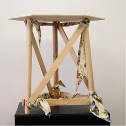
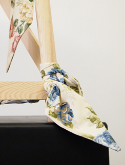
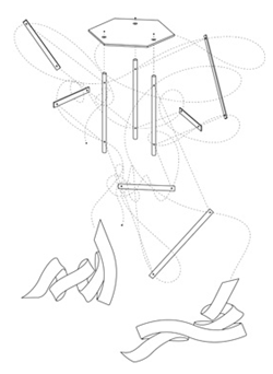
I love the genius of product design. The series of tables designed by Goncalo Campos, are made only using two basic materials, fabric and wood, the most commonly used materials in most households. They are designed to be assembled with no glues or external fixtures, other than fabric, using a simple construction technique - they look primitive but at the same time very elegant. I can see the possibilities using beautiful woods, such as ebony, walnut, or perhaps fumed wood, and coordinating the fabric to match the colors and mood of your room. They would make wonderful conversation pieces for a wedding, or summer lawn party.
Goncalo Campos is a Portuguese designer, born in 1986. Graduated in product design in 2008, after which joined Fabrica team, for a year and created a series of of tables which were featured in the exhibition Mais que Partes (More Than Parts), shown in the Fabrica features shop in Lisbon.
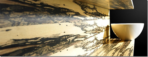
Fumed wood veneers – White Ebony
Patricia Gray Inc is an award winning Interior Design firm in Vancouver, Canada who blogs about WHAT'S HOT in the world of Interior Design.
2010 © Patricia Gray | Interior Design Blog™
Furniture IS Lifestyle - DEDON LAUNCHES “COMING HOME”, A LIMITED-EDITION BOOK BY BRUCE WEBER
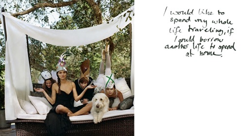
DEDON LAUNCHES “COMING HOME”, A LIMITED-EDITION BOOK BY BRUCE WEBER
I love the new lifestyle advertising campaign that the Dutch company Dedon, a manufacturer of outdoor furnishings, has launched. You may have seen the ads for this Dedon campaign in some of the recent Design magazines - Dedon is selling their furniture as lifestyle. DEDON takes its collaboration with legendary American fashion photographer Bruce Weber to a next level with the publication of a new book Coming Home, a sumptuously produced, limited edition book. Building on themes that Weber developed for the current DEDON advertising campaign, Coming Home is an exploration into the meaning of home and the feelings we hold for it. Personal, poetic and eclectic, the book weaves together exclusive imagery by Bruce Weber with artwork and illustrations specially commissioned by the photographer. Watch the Dedon movie in large format here, or on YouTube here. The music and imagery are spectacular. The movie starts with a quote from the movie Out of Africa - the words of Denys Finch Hatton, played by Robert Redford: “I don’t want to live someone else’s idea of how to live.”
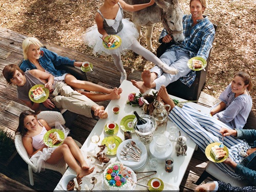
DEDON “COMING HOME”, A LIMITED-EDITION BOOK BY BRUCE WEBER
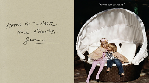
DEDON “COMING HOME”, A LIMITED-EDITION BOOK BY BRUCE WEBER
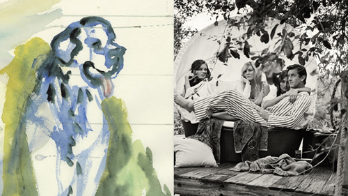
DEDON “COMING HOME”, A LIMITED-EDITION BOOK BY BRUCE WEBER
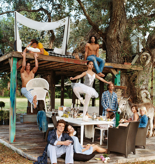
DEDON “COMING HOME”, A LIMITED-EDITION BOOK BY BRUCE WEBER
A multilevel treehouse, a cast and crew of 60 people with legendary fashion photographer Bruce Weber keeping it all together.
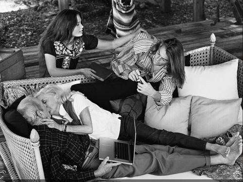
DEDON “COMING HOME”, A LIMITED-EDITION BOOK BY BRUCE WEBER
When I first saw the Dedon ad campaign, by Bruce Webber I was mesmerized by it. Some people I have talked to just don’t get it.
After all Bruce Webber was the photographer for the controversial ad campaign for Calvin Klein in the 90’s, and
Webber also photographed a shirtless Chris Isaak in bed for a fashion spread in Rolling Stone.
Dedon says about Coming Home “…….it is an exploration into the meaning of home and the feelings we hold for it.”
I say that ‘Furniture IS Lifestyle’ and has as much of a message to say about how we live as Fashion does!
What do you think about ‘Lifestyle Advertising?’ Leave your comment here.
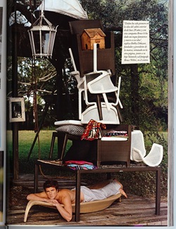
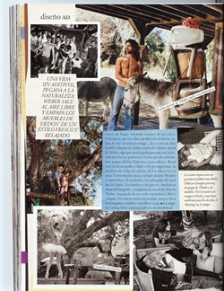
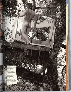
DEDON “COMING HOME”, A LIMITED-EDITION BOOK BY BRUCE WEBER Architectural Digest Spain - May 2010
Postscript: These are scans from a Spanish magazine that my friend and fellow blogger Ivan Meade sent to me after I published this article.
Patricia Gray Inc is an award winning Interior Designer firm in Vancouver, Canada who blogs about WHAT'S HOT in the world of Interior Design.
2010 © Patricia Gray | Interior Design Blog™
Judge A Book By Its Cover
 I love receiving my weekly Houzz updates, because they are a little treat waiting for me in my email. This weekend I especially loved the photos of a little house with a modern soul. If I were walking down the street and came across this place, I would wish that I could run inside. Funny enough, I have seen the inside because it is the home of Morgan of The Brick House. (Some time ago I mentioned this blog here).
 The Brick House is all about modern design on a budget, which is an idea that is close to my heart. It frustrates me that we tend to associate modern with large expense! Don't get me wrong I love reading Dwell or Architectural Digest as much as the next person, but that isn't really practical for most of us, right? Fortunately, Morgan doesn't let a small budget hold her back and I LOVE this amazing detail on the front of the house. I have to confess that I'm including this photo in hopes that it might inspire all you modern lovers who think your house could never express your ideas. Just think a little out of the box...ha, ha!
Composite Decking: Stone Deck
A Year's Worth Of Time
Whats Hot? Fuego Outdoor Living Grill
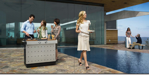
I am in the process of designing an outdoor patio for clients. It is a challenging project as well as being very exacting, with a lot of technical details to take into consideration (gas lines, water lines, electrical panel load limits, permit approvals, etc), before I can even start on the ‘pretty stuff.’ This outdoor patio is on the roof of a penthouse, with a spectacular view of the ocean, mountains, and city of Vancouver. It is a breathtaking 130 feet in length, and is probably larger than most people’s back yards.
Every once in awhile I come across a new and innovatively designed product that causes me to stop and take notice, and with a sigh of relief, that I have found an esthetically pleasing alternative to a category of product design that generally leaves my visual sensibilities assaulted. Finally an outdoor grill (notice that it is not referred to as a BBQ - ‘Grill’ is the operative new terminology), that shakes up tradition, and is beautiful to look at. “A campfire for modernists,” “a social magnet with a great sense of style.” Attaching a label to this Fuego outdoor living grill is trickier than throwing a salmon – wild, rubbed with herbs and spices – on an open flame. As well as Fuego being a top rated grill, it has a modernist design aesthetic with sleek-lined minimalism. One that I wouldn’t mind gracing my clients’ patio.

Fuego Grill 01
What do you think? Would you like to have this Fuego grill gracing your patio?
I’ll take the pool!
Patricia Gray Inc is an award winning Interior Designer firm in Vancouver, Canada who blogs about WHAT'S HOT in the world of Interior Design.
2010 © Patricia Gray | Interior Design Blog™
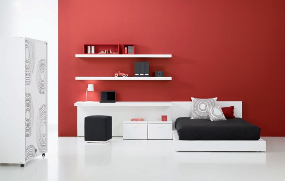
ELEGANT TEEN BEDROOM DECOR IDEAS PICTURE


Green Day 2!

Modern Bookcases
That is, until you want to carry ten books with you when you travel. And most of them are hardbacks. Times like that make us wonder if printed books are going the way of CDs, you know. Like, who buys CD anymore?
But as we were driving down the Melrose Design district the other day, this gorgeous bookcase from the Poliform showroom almost caused us to crash the car. It is STUNNING! It's huge and it's perfect if you have a loft with very tall ceiling.
We don't have the pricing information for this item, sorry. Poliform is very high-end and upscale, so it is probably really expensive. But, if you have a really good carpenter, it's probably really easy to build! And, wouldn't it be great as a room divider too? Just make sure your carpenter anchor it properly.
You see, there is always a place for books! Ipad or no Ipad.
To see more bookcases from Poliform, click here.
Five Ways to Make Your House Younger
Anyway, the reason we mention it is because reading a LA Times review on the show we saw one funny line-- "To think we spent all that time and effort and money trying to look 10 years younger and 10 pounds lighter," says Malick, a recently unemployed soap star now being offered grandma roles, "and all we had to do was crash-land in Cleveland."
You'll have to be at that age to know what we are talking about! You know, the age where we look at younger women more than our husbands do? The age that we keep saying to ourselves, man, if I can only have my old body back with my current brain?
Which leads us to this point, do you know your house can look 10 years younger too? Most people don't realize this, but the way we decorate our house is very much like the way we dress, it literally can add or subtract a few years.
Here are five ways you can instantly update your home:
1) Use fresh and happy colors via use of wallpapers, paints and fabrics.
Wallpapers are so in now. We love, love it. Not as much to wallpaper every room like they did in the sixties, but by wallpapering just one wall or a small bathroom or dining room, you can instantly freshen things up.
2) Get rid of things that are outdated.
You know how mom's jean just add 10 years to your age and 10 lbs to your butt? Outdated things like ivy silk plants, sofa arm covers, oak furniture, shabby chic sofas (so 80s!) are the equivalent of mom's jeans. Worse yet, it screams "grandma"!
3) Update your furniture
Furniture is like fashion. It changes with time. You probably notice that furniture are not as heavy as they use to be. The heavy, ornate look for furniture (think Real Housewives of Orange County/New Jersey/Atlanta) are as out as McMansions. Rather, look for furniture that are modern and clean-lined with fresh designs. If you have upholtery pieces with good bones (say, a very comfortable sofa), consider re-upholstering it with new fabrics. The fabric choices nowadays are amazing.
4) Get small little things that count.
Sometimes things are so tough that shopping is not an option (2008-2009, anyone?). But you know how sometimes a little thing can make us feel much better, say, a tube of pretty lipstick? It's like that for the home too. We spend so much time in our home, it's ok to treat yourself a little bit. Little things like dressing your bed with really good sheets, make your bathroom like a spa etc. goes a long way. You see this with a good hotel--it's the little details that make all the difference.
So consider buying a new rug, a couple of pretty pillows--it doesn't have to be expensive. Homegoods is a good store for bargains like this. Buy lots of books secondhand. They make you look smart (and great accessories too).
Note: A good source for hotel things is American Hotel Registry. They sell actual hotel sheets, pillows and mattresses and from what we can see, the prices are pretty good and that you can buy directly from them. (We are not affiliated with this site in anyway)
5) Go contrarian.
The problem with trend is that after a while everything looks the same. Remember how Juicy Couture was all the rage just a couple of years back? What happened now to those velour tracksuits?
Home trends are like that too. After a while everyone's house look the same. Enough with the granite counter already. Enough with one paint color for each room. And please, do we need 10,000 square feet home?
The best styles are the ones that buck against the trend, stay true to the classic, and retain its integrity.
Go with your personality and your style, unless, of course, you have no style (in that case, consider hiring help).
Just remember that simpler is better, and less is more.
Masculine Furnishings for Men
So consider this a "Straight Women for Straight Guys" intervention. Furnishings can be very masculine and stylish at the same time. Here are some of our favorite furniture lines that have that combination:
Thomas O'Brien for Hickory Chair:
This line is what we would describe as modern American classic. Very clean-lined. Solid, neutral colors. A little bit pricey, but it's the kind of furniture that won't go out of style for a long time.
Michael Weiss for Vanguard Furniture
This is another one of our favorite collection. Manly, but not overly so. There are some soft touches in the details that we like. Less expensive than Thomas O'Brien, and the quality is just as nice.
Brownstone Furniture:
If you are looking for an affordable line with coordinating and matching items, Brownstone is a good choice. Very inexpensive. They just added a new upholstery collection, which is really nice. We like the upholstery collection a lot more than the casegoods (industry term for wood pieces).
Bolier Furniture
If your man likes really, really simple, clean-lined things he'll like this line. Pricey (more on the wood pieces than upholstery-the upholstery products are a bit more reasonable). It could be a little severe (because it's all straight lines and geometric and muted colors).
As always, warm up these rooms with accessories--such as rugs, artwork, fresh flowers, books etc. We can't emphasize enough what a huge difference this would make.
Ultra Cool Barstool
The seat is upholstered in Italian leather and the base is a solid steel. Very substantial and heavy. The seat runs a bit small in size. Shown here in black, it is also available in white and brown leather. The base is hydraulic, which means you can adjust the seat heigh.
The price is $475.
I'm Making Big Changes!

 So we have finally made the decision to move। In fact, school districts have forced us into the decision, but I don't care because I've been ready for a change!! So, currently I am in the process of preparing the house to put on the market and to somehow de-personalize my very, VERY personal space. Wish me luck!
What happened to our taste?
And did you know, the White House crasher made the cut to the Bravo's series Real Housewives of DC?
Here's an excerpt from the Bravo site:
"Michaele Salahi
This northern Virginia native and model is a big part of the inner workings of the D.C. life. She and husband Tareq together founded America’s Polo Cup, for which he is the U.S. team captain. Through her involvement in the Polo Cup, which has become one of the largest and most high profile polo events in the U.S., Michaele has met numerous political leaders across the globe. Additionally, the two are involved in running the Salahi family vineyard, Oasis Winery. Always on the move and juggling multiple projects at once, Michaele is heavily involved in charity work, including being an advocate and fundraising for MS and the Leukemia & Lymphoma Society. A family girl at heart, Michaele loves spending time at the family vineyard with her stable of horses and beloved dog Rio."
No mention of how tacky these people are and how many lawsuits they are involved with (check out the details here).
Blog Crush


